Project background
I always get excited about a challenging project that gets me out of my comfort zone! This is the sort of work that sparks creativity and reminds me of my passion for UX/UI design.
This project truly was one of a kind. I worked on the project for NZTA through
Abely, and it ran over a period of just 10 days. NZTA then selected their favourite design from multiple submissions, based on UX/UI, development and efficiency. Our design not only won, but NZTA were left thoroughly impressed by our work!
National Speed
Limit Registeration
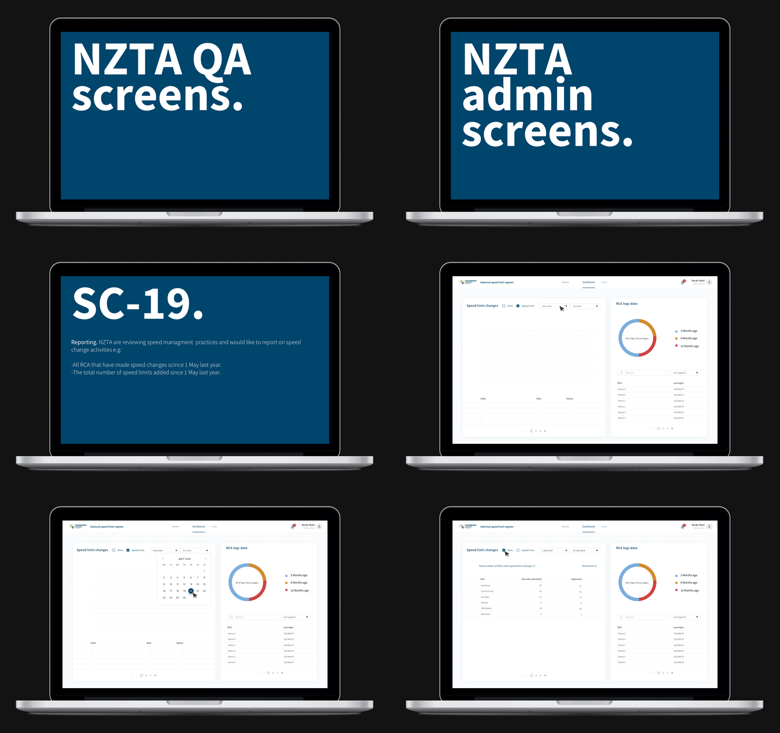
The task was to create a website based on Geospatial Mapping, displaying the speed limits of all New Zealand’s roads. The challenge followed different scenarios and user flows for a variety of user types; For example, Government, Police etc. Each user type having a unique UI, with customised flow and experience.


