Discovery Phase
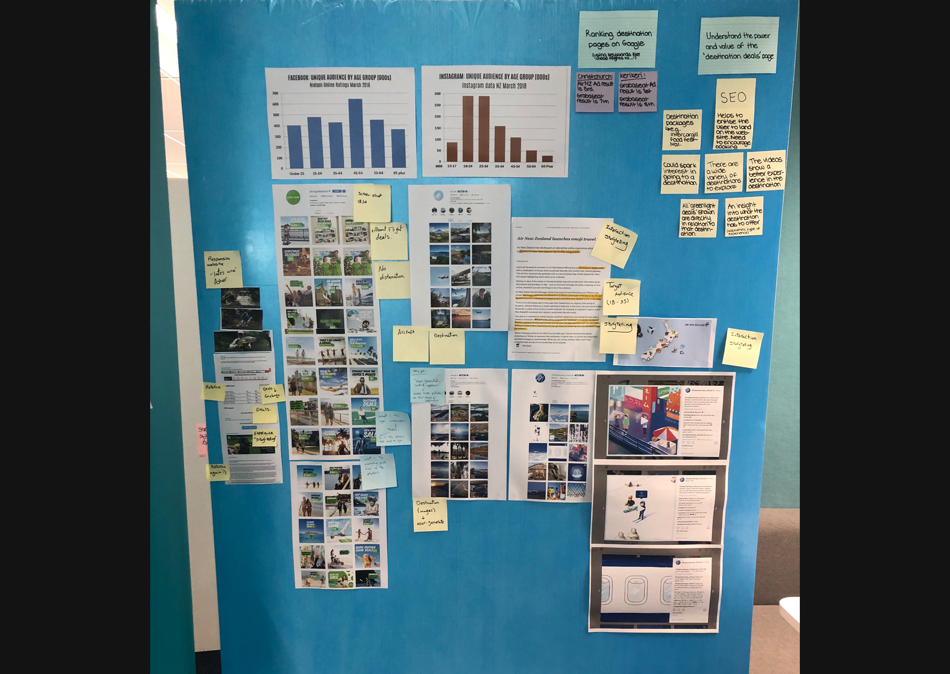
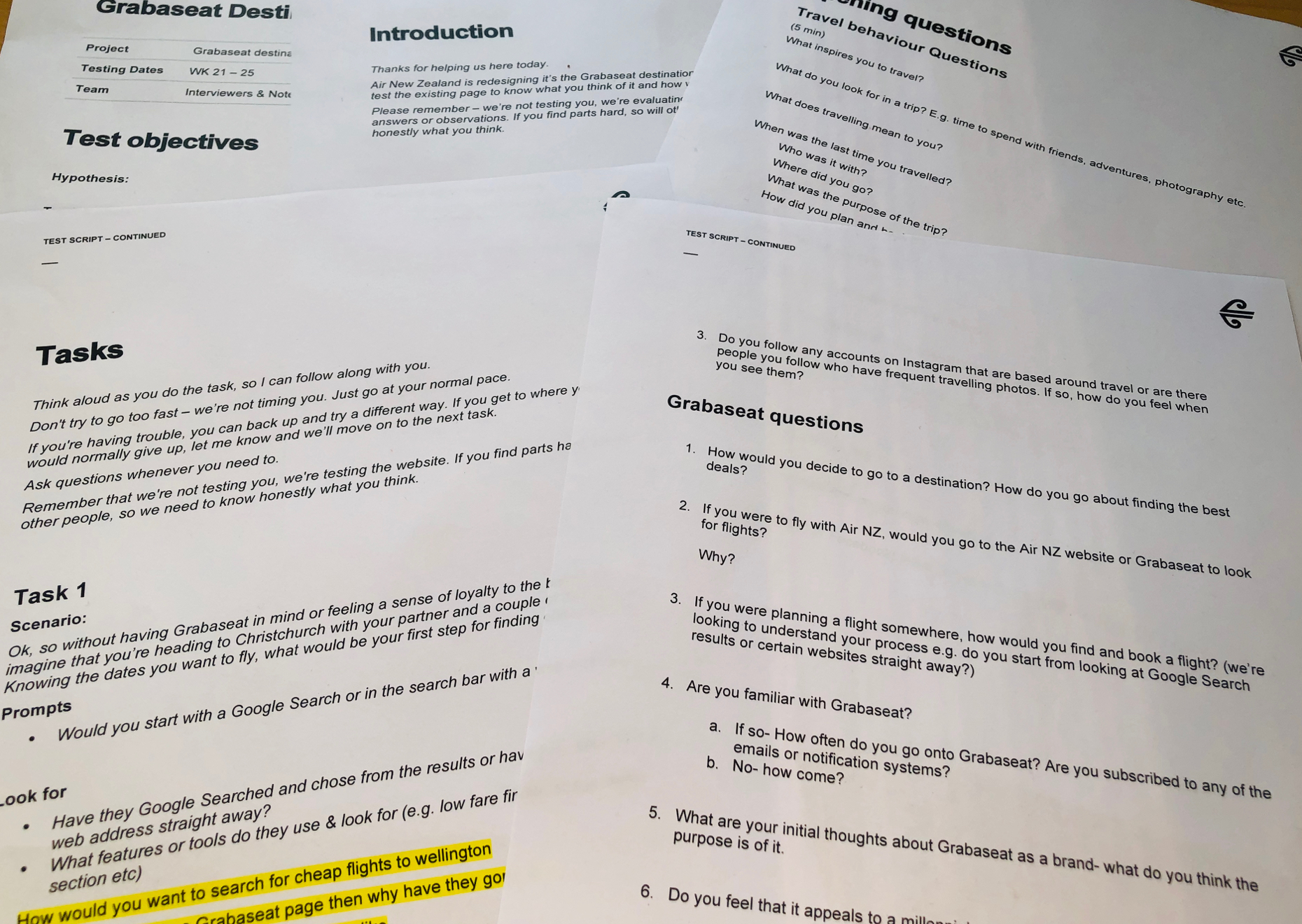
During the discovery phase, we built an interview script based on our research assumptions.
The aim of interview script was to validate our findings and direct us to the correct pain points for the target audience.
Assumptions
The assumption was that Kiwi youth are influenced by social media when making travel destination decisions. We assumed that their reason for travel is to get social media worthy images.
According to that, we assumed that to raise awareness of the international flight deals, we needed to focus on the experience they’d get from each destination, and the photos they would be able to share to their social media accounts.
The Script
The script is divided into three sections:
Section One: 5 Minutes
We asked open ended questions using the no leading technique to understand their true perspectives. The aim was to recognise the relationship between social media and travel from their perspective.
Section Two: 3 Minutes
Here, we asked questions regarding their experience with Grab a Seat. We wanted to know their previous experience with Grab a Seat and if they knew about the international flight deals on offer.
Section Three: 3 Minutes
The purpose for section 3 was to gauge their current behaviour when booking a flight. We gave them a task to understand how they book flights and choose travel destinations.
We gave them this scenario:
"Imagine you’re heading to Christchurch with your partner and a couple of friends.
Knowing the dates you want to fly, what would be your first step for finding cheap flights?"
Using Contextual Inquiry Method:
We listened, observed and recorded what they did during the task.
Define Phase
Next, the data we collected was used to refine the results and get direction for the design.
Affinity Map Method
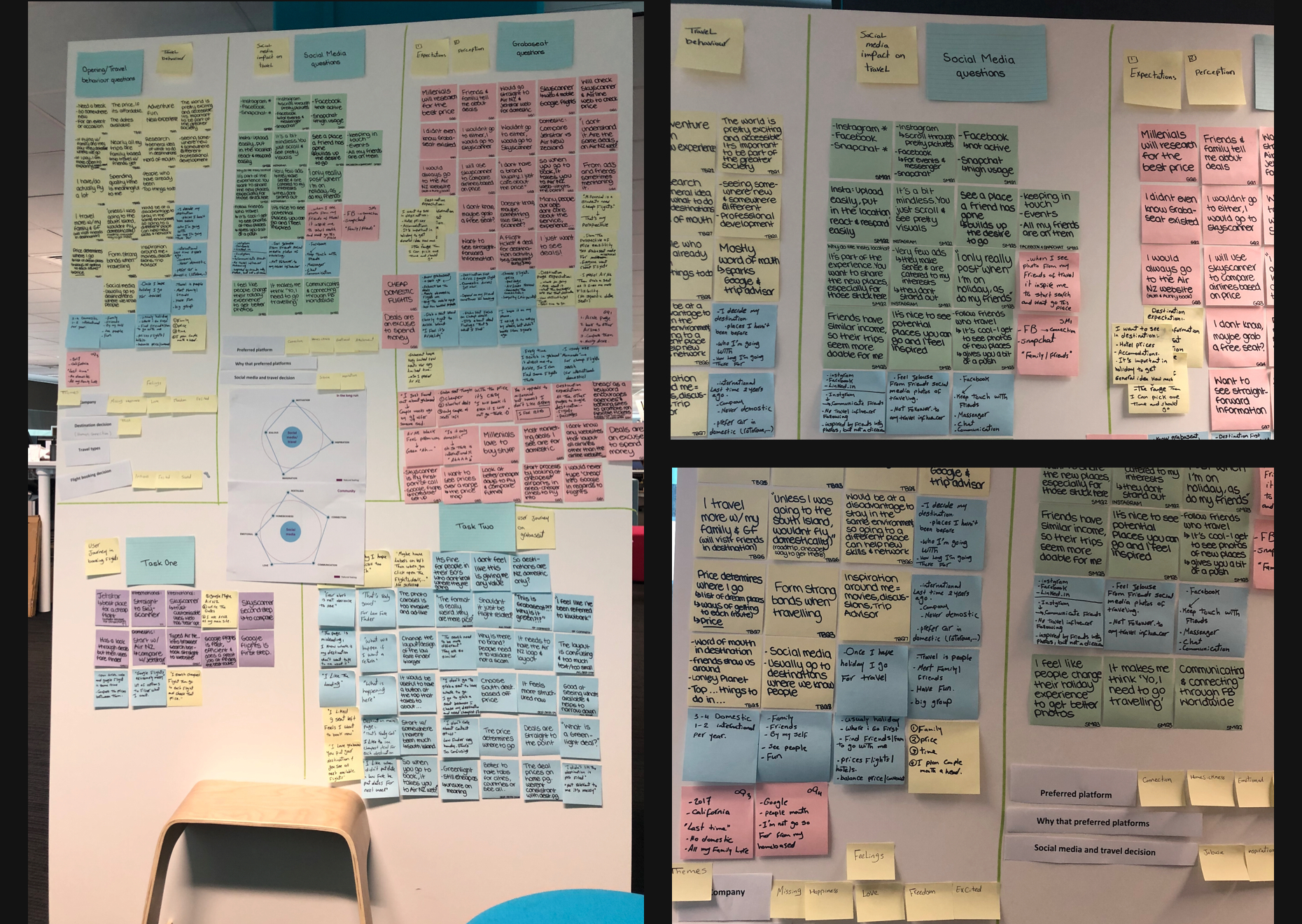
We began by writing their answers on sticky notes, then sorting them into themed categories.
For example: the same answer or word, or the same process in booking flights. We then prioritised the categories and determined the next step.
Results
Surprisingly, the results were opposite to our assumptions! This showed me the importance of engaging users, rather than relying on assumptions.
The affinity map showed that the target audience care about their financial status. Social media is not the main reason for choosing their destination. They do their own research before travelling and choose their destination and flights around what will fit their budget.
It was interesting to note that photos and social media did not have much influence on their choices.
For the target audience, booking flights is about trust in the provider, the experience they’ll get out of it and a reasonable price. They want to use a trusted platform for their flight deals, and prefer to use google flights of Skyscanner.
Solution Prototyping
The Grab a Seat website fails to convey that it is part of Air New Zealand. It also fails to promote its international flights.
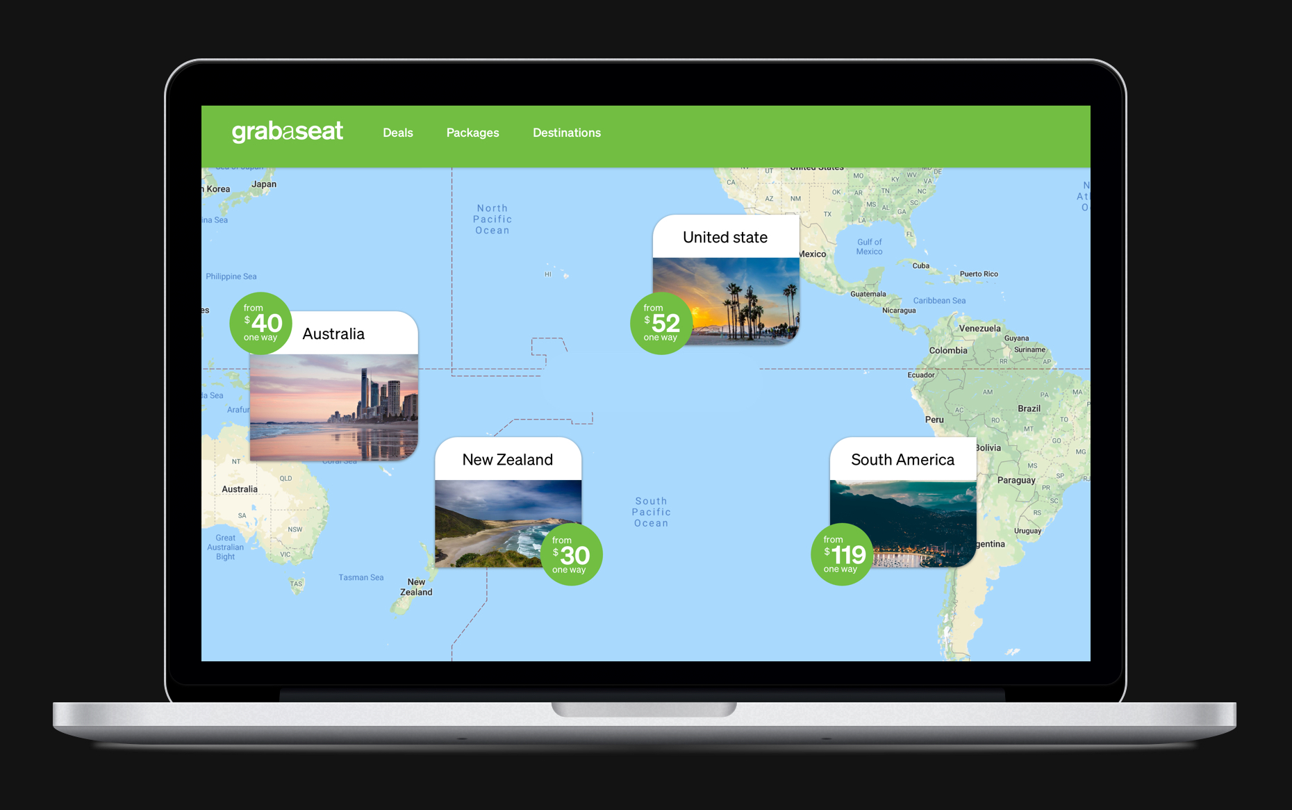
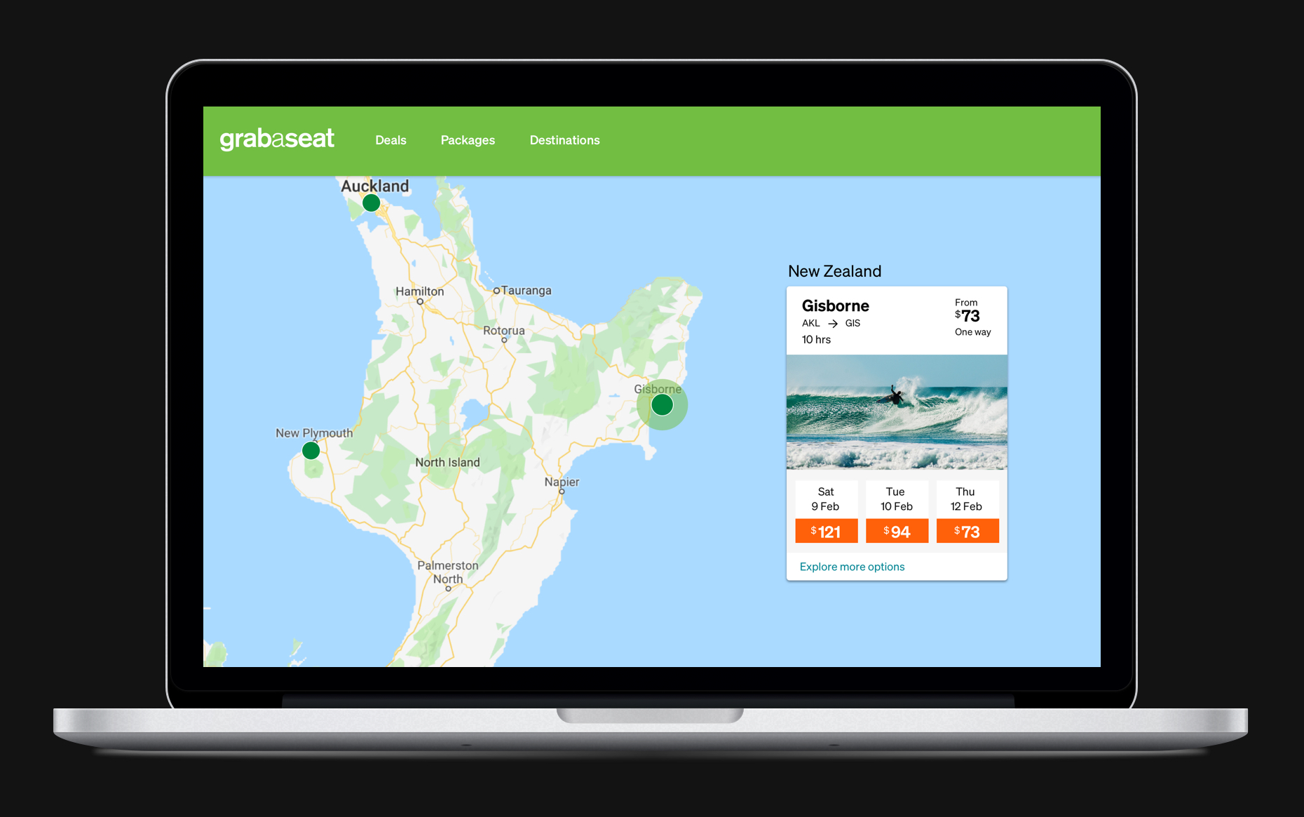
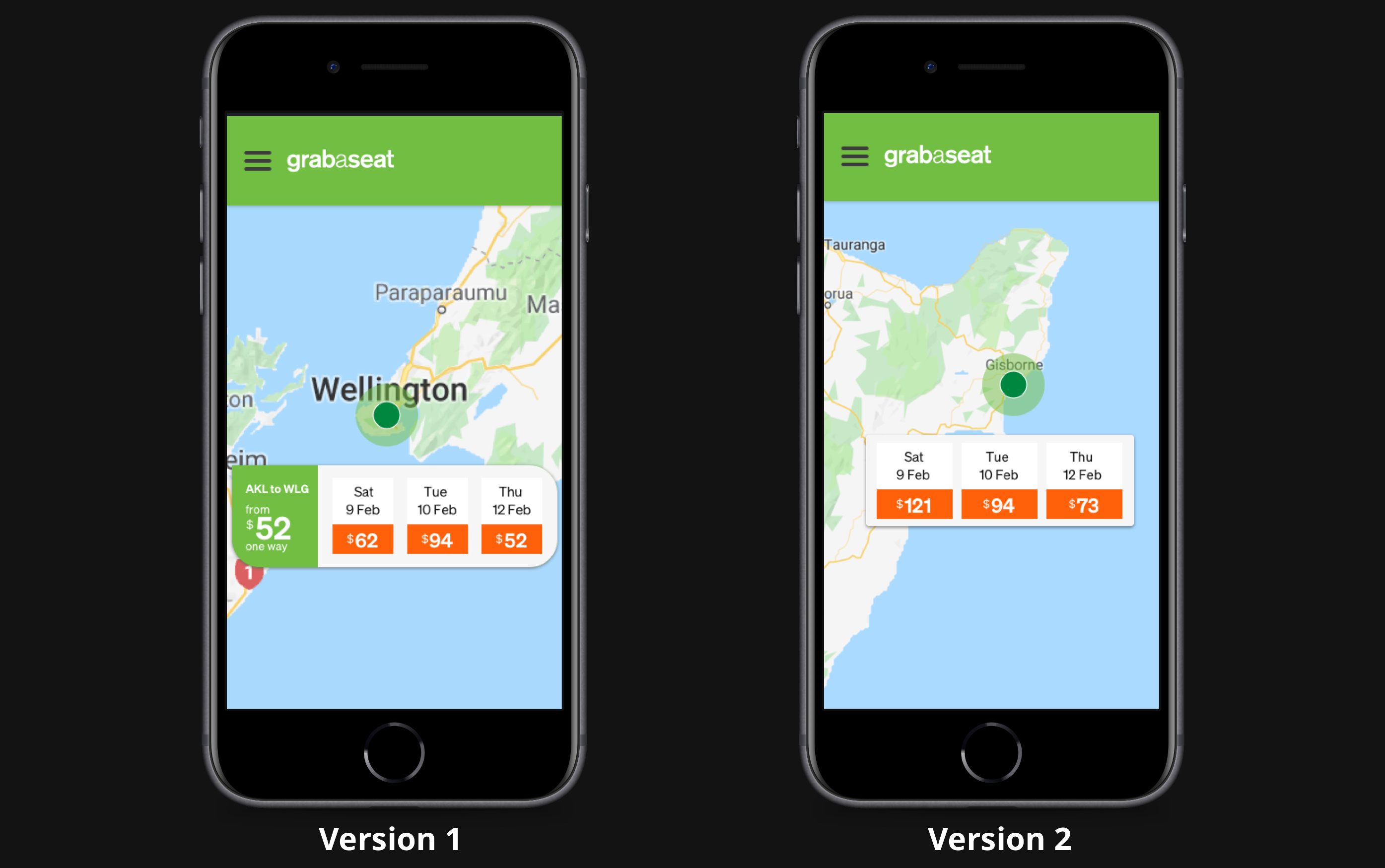
I created a map experience in the website, displaying the cheapest flights throughout the world. This solution fulfils the need for cheap flights while displaying international flights through the world map.
Future Solution Suggestions
The analytic results of Grab a Seat show that most users are aged 35+.
Because they fail to show their relationship with Air New Zealand, users that haven’t dealt with them before think they’re untrustworthy.
A solution for Grab a Seat would be to more clearly identify as owned by Air New Zealand.

