Challenges
1. 30% of AT’s call centre inquiries are from people who can’t find suitable transport options despite using the Journey Planner feature.
2. I was only given four weeks to work on this project before production.
3. Auckland Transport’s design system is owned by a third company called Purple Shirt, which meant working with them to ensure my design components were consistent and cohesive.
Strategy
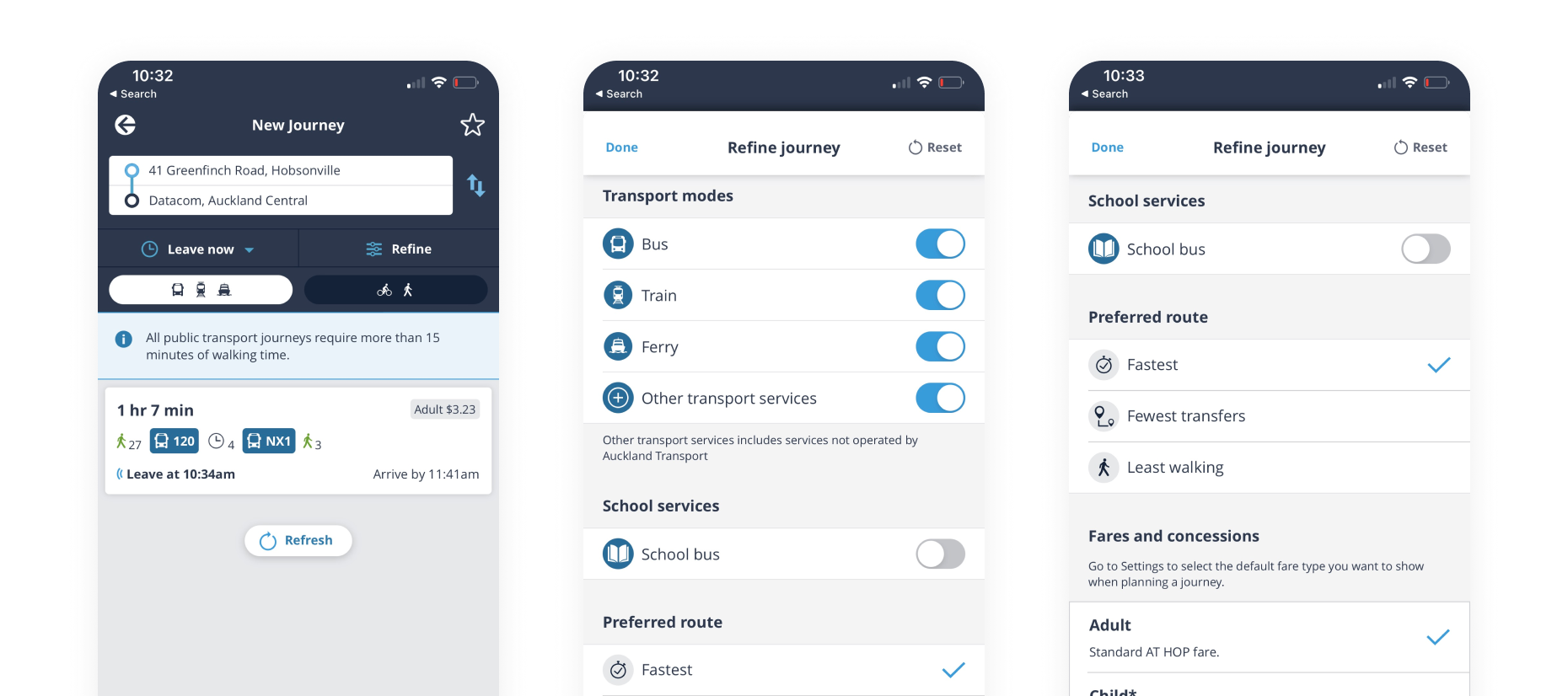
I worked closely with Auckland Transport’s product owners and the team at Purple Shirt to make sure my designs aligned with their system for a more consistent user experience.
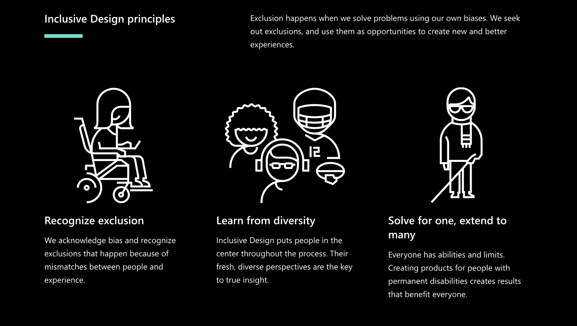
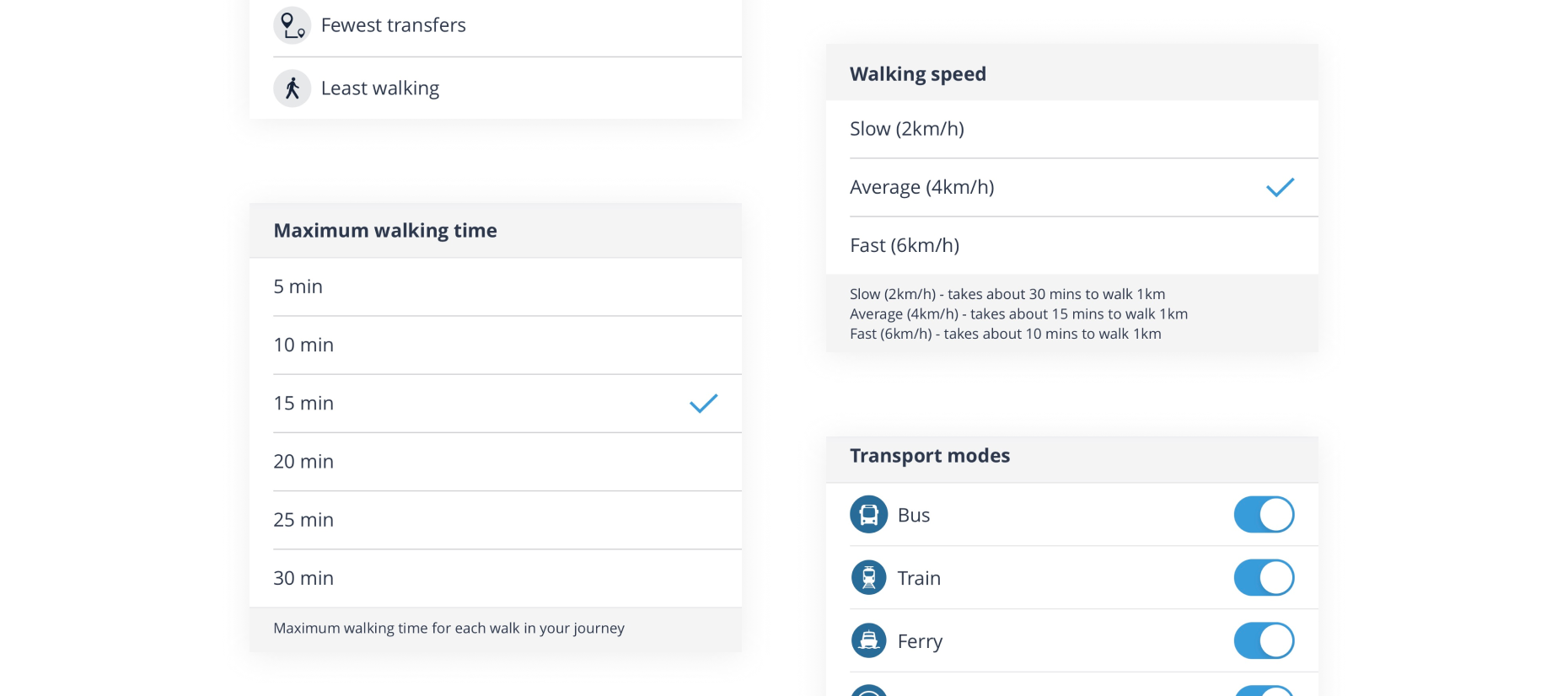
Since the design system was in its early stages, I designed new components from scratch. This meant redesigning all the screens to improve UX flows and customer scenarios for better usability outcomes. I also considered people with disability and incorporated their needs into my designs and features by designing an accessible UI components that meets the WCAG standards.
I was careful to keep in touch with Purple Shirt throughout the process to ensure the design components were consistent and cohesive. After completing the designs within the deadline period, I created development-ready design files for an easier handover to their team.
Impact
This project holds a special place in my heart because I knew was creating something with a positive impact for people. However, there were a couple of challenges due to the tight timeline, mainly that we could not implement user testing within the short four-week period.
When I handed over my work to Purple Shirt, I documented every detail including my assumptions and hypothesis to be considered during the user testing phase. I also encouraged the team to conduct testing as soon as possible to ensure the design was truly human-centric.
This project resulted in positive feedback from both the clients at Auckland Transport and the team at Purple Shirt who appreciated how detailed my handover was. Overall, they were pleased that I delivered an entirely new UX flow and design within their deadline.


